Saturday, April 27

A Curated Gallery of Beautiful Fonts for Creative Designers

39,832 Premium Fonts

«Back ·

Tracking: { 'Country Code': 'US', 'Language Code': 'EN-US', 'Email Hash': 'unknown', 'Vendor User Id': 'unknown', 'Vendor Id': 'unknown', 'Customer Type': '', 'Offer Code FONT Download

tracking: {
            'Country Code': 'US',
            'Language Code': 'EN-US',
            'Email Hash': 'unknown',
            'Vendor User Id': 'unknown',
            'Vendor Id': 'unknown',
            'Customer Type': '',
            'Offer Code font preview Previous: tracking: {
            'Country Code': 'US',
            'Language Code': 'EN-US',
            'Email Hash': 'unknown',
            'Vendor User Id': 'unknown',
            'Vendor Id': 'unknown',
            'Customer Type': '',
            'Offer Code Font Next: tracking: {
            'Country Code': 'US',
            'Language Code': 'EN-US',
            'Email Hash': 'unknown',
            'Vendor User Id': 'unknown',
            'Vendor Id': 'unknown',
            'Customer Type': '',
            'Offer Code Font
tracking: {
            'Country Code': 'US',
            'Language Code': 'EN-US',
            'Email Hash': 'unknown',
            'Vendor User Id': 'unknown',
            'Vendor Id': 'unknown',
            'Customer Type': '',
            'Offer Code downloadDesigner: Rian Hughes
Publisher: Device
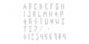
Worthington Arcade is a classically-proportioned capitals-only type incorporating a selection of ligatures and alternates.

It loosely resembles the hand-painted architectural lettering of the 30s to the 50s, exemplified by the likes of Percy Smith's interior signage for the BBC or George Mansell's lettering for the University of London and the signs found on London's bridges. However, rather than a slavish copy of any historical model, it is more an examination and evocation of certain idiosyncratic quirks of civic lettering of the period, and an attempt to create a peculiarly English titling typeface.

The round letters, for example the O, Q and C, are wider than the perfect circle usually found in such designs, while the straight-sided characters, usually drawn on a square, are narrower. This lends the whole a subtle elegance that is also emphasized by the raised crossbars on the H, E and F and extended lower leg of the E.

Includes old-style numerals.


classic display elegant ligatures 30s 50s alternates architectural architecture aristocratic book cover british capitals circle classical demure english expensive fashion formal gill headstone high-end inscribed inscription inscriptional luxury monument old style old-style figures olden perfume perpetua premier premium refined round sans sans serif signage sophisticated trajan understated wedding rounded slab serif slabserif
Back to the top